Centered Card Misconceptions: Understanding Card Layout Errors
Debunk common centered card misconceptions in UI layouts for cleaner, consistent designs. Improve readability and visual hierarchy with strategic centering.
Estimated reading time: 10 minutes
Key Takeaways
- Centering is a strategic tool, not the default for every element.
- Separate card positioning from inner content alignment for clarity.
- Use modern CSS (Flexbox, Grid) rather than eyeballing measurements.
- Test across devices to avoid off-center drift and readability issues.
- Balance visual weight with padding and internal grids, not just pixel math.
Table of Contents
- Section 1: What Is Card Centering?
- Section 2: Overview of Common Misconceptions
- Section 3: Debunking the Misconceptions
- Section 5: Visual Examples & Case Studies
- Section 6: Best Practices for Centering Cards
- Conclusion
- Additional Resources
- FAQ
Section 1: What Is Card Centering?
Keyword: centered card misconceptions, card centering
At its core, card centering involves two distinct decisions:
- Card position in the parent container – placing the card itself within a hero section, grid, or wrapper (e.g., a solo feature card in a hero banner).
- Content alignment inside the card – determining how headings, images, icons, and buttons align relative to card edges (e.g., centering a CTA button).
Why it matters:
– Visual hierarchy: Proper centering highlights primary offers or hero messages.
– Readability & scanning: Aligned elements guide the eye, reducing cognitive load.
– Consistency: Predictable centering rules strengthen design systems.
– Responsiveness: Centering adapts seamlessly from mobile to desktop.
CSS examples:
Flex centering
.wrapper {
  display: flex;
  justify-content: center; /* horizontal center */
  align-items: center;    /* vertical center */
}
Grid centering
.grid-container {
  display: grid;
  place-items: center; /* centers both axes */
}
Section 2: Overview of Common Misconceptions
Keyword: centered card misconceptions
Designers often fall for these seven centered card misconceptions:
- “Centering everything is always more elegant.”
- “If the card is centered, all content inside must be centered.”
- “Centering is just visual; exact measurements don’t matter.”
- “If it looks centered on my screen, it’s centered for everyone.”
- “Centered cards are bad for usability and should be avoided.”
- “Using text-align:center means the card is centered.”
- “Centered cards always work better for mobile.”
Why these myths persist:
– Intuition over rules, shortcut thinking with text-align, and device blind spots.
Impact:
– Flat interfaces, broken polish, inconsistent breakpoints.
Section 3: Debunking the Misconceptions
Keyword: centered card misconceptions
Myth #1: “Centering everything is always more elegant.”
Reality: Over-centering flattens hierarchy and reduces readability.
Better rule: Center only primary focus items; left-align supporting content.
.hero-card {
  margin: 0 auto;
  max-width: 600px;
  text-align: center; /* for short headlines/CTA */
}
.body-text {
  text-align: left; /* better for long paragraphs */
}
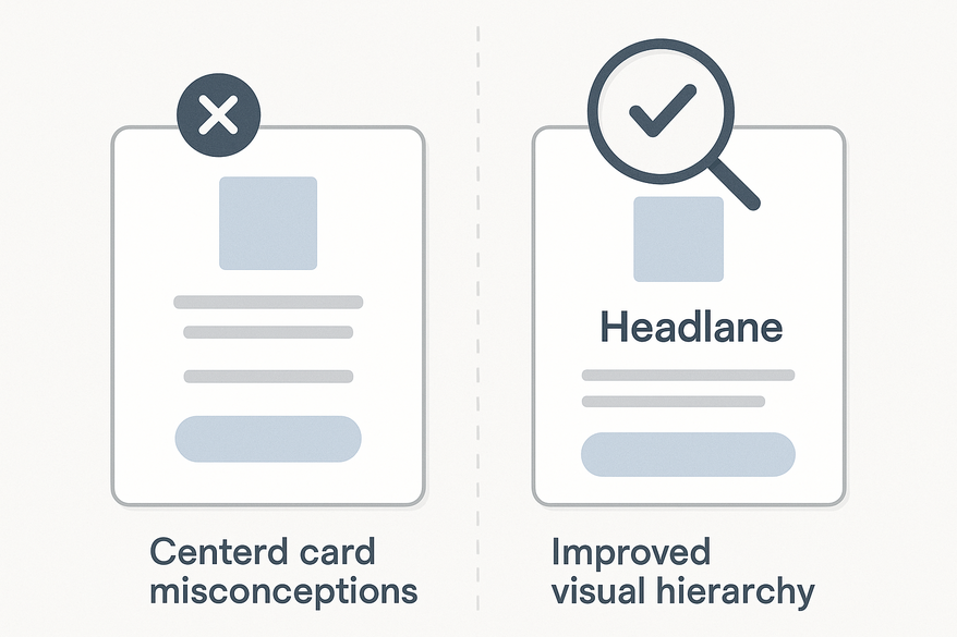
Myth #2: “If the card is centered, all content inside must be centered.”
Reality: Position and inner alignment serve different goals.
Better rule: Mix centered titles with left-aligned descriptions.
<div class="card centered">
  <h2 class="card-title">Product Name</h2>
  <p class="card-description">Features and specs go here.</p>
  <button class="btn">Buy Now</button>
</div>

.card.centered {
  margin: 0 auto;
  max-width: 300px;
}
.card-title {
  text-align: center;
}
.card-description, .btn {
  text-align: left;
}
Myth #3: “Centering is just visual; exact measurements don’t matter.”
Reality: Even a few pixels off feels wrong.
Better rule: Use grid systems or CSS centering—avoid eyeballing.
.container {
  display: flex;
  justify-content: center;
}
.card {
  width: 320px;
}
Myth #4: “If it looks centered on my screen, it’s centered for everyone.”
Reality: Hard-coded pixels break at other resolutions.
Better rule: Rely on relative units (%, rem) and responsive layouts.
.grid {
  display: grid;
  grid-template-columns: repeat(auto-fill, minmax(250px, 1fr));
  justify-content: center;
}
Myth #5: “Centered cards are bad for usability and should be avoided.”
Reality: Poor centering is bad; well-executed centering focuses attention.
Better rule: Use centering for single actions, empty states, highlight tiles—not dense content.
Myth #6: “Using text-align:center means the card is centered.”
Reality: text-align affects only inline content.
Better rule: Use block-level centering for the card, text-align for its text.
.card {
  margin: 0 auto; /* centers the card */
  width: 280px;
}
.card-content {
  text-align: center; /* centers text within */
}
Myth #7: “Centered cards always work better for mobile.”
Reality: Short centered content can shine; long centered text hinders readability.
Better rule: Center single cards with minimal copy; left-align multi-line or input-heavy cards.
Section 5: Visual Examples & Case Studies
Keyword: centered card misconceptions
Compare these mockups to see improvements in clarity and scanning:
- Over-Centered Layout vs Balanced Grid
Left: Every card and text block centered – floaty, low scan rate.
Right: Hero card centered, others aligned to grid columns. - Card vs Content Alignment
Left: Centered card plus centered paragraphs – low readability.
Right: Centered card with left-aligned body copy and CTA. - Eyeballed Centering vs Grid-Enforced Centering
Left: Card “looks” centered but is 15px off; include measurement guides.
Right: Card centered via Flex/Grid; guides confirm equal margins. - Mobile Case Study
Left: Three stacked cards, all centered text – hard to read.
Right: Primary card centered, subsequent cards left-align text for quick scan.
Section 6: Best Practices for Centering Cards
Keyword: centered card misconceptions
Follow these actionable guidelines:
- Decide what needs centering
• Hero and primary CTA cards.
• Empty states, modals, splash screens.
• Avoid auto-centering every card. - Respect your grid
• Align cards to grid columns and consistent gutters.
• Center the entire grid container when needed. - Separate card position vs internal alignment
• Card container: margin, flex, or grid.
• Inner content: text-align, padding, child flex containers. - Leverage modern CSS
/* Center card in container */ .container { display: flex; justify-content: center; } .card { max-width: 360px; } /* Center grid within page */ .card-grid { display: grid; grid-template-columns: repeat(auto-fit, minmax(240px, 1fr)); gap: 1rem; justify-content: center; } /* Internal alignment classes */ .content-center { text-align: center; } .content-left { text-align: left; } - Test across devices
• Mobile (320–414px), tablet, desktop.
• Check for off-center drift, awkward text breaks. - Evaluate by visual weight
• Balance images, shadows, and text blocks.
• Use equal padding and internal grids to correct shifts.
Conclusion
Keyword: centered card misconceptions
Centered card misconceptions often stem from intuition overriding rules. Remember:
- Centering is strategic, not the default.
- Card centering ≠ content centering.
- Use Flexbox/Grid, not eyeballing.
- Test across devices and screen sizes.
- Balance visual weight, not just pixel math.
Apply these corrections for more intentional, readable, and consistent card layouts. Have a tricky scenario? Share your questions in our community forum.
Additional Resources
- Card-Based Design: What It Is and Why It Works – Smashing Magazine
- MDN Web Docs – Flexbox
- MDN Web Docs – CSS Grid Layout
- Nielsen Norman Group – Visual Hierarchy in UX
- Web.dev – Responsive Web Design Basics
FAQ
Q1: Should I center all cards in a grid?
Answer: No. In multi-column grids, align cards to column edges and center the grid container, not each card.
• Terminology: “gutter” is the space between columns.
• Tip: Use justify-content: center on the grid container.
• See: MDN grid
Q2: Is it okay to mix centered and left-aligned cards?
Answer: Yes, when hierarchy demands a standout card.
• Use left alignment for group consistency, center for featured content only.
• Tip: Apply alignment changes sparingly to guide users.
Q3: How to center cards vertically & horizontally?
Answer: Use Flexbox or CSS Grid:
.wrapper {
  display: flex;
  justify-content: center; /* horizontal */
  align-items: center;      /* vertical */
  min-height: 100vh;
}
• Terminology: “hero section” is the top area of a page.
• Tip: Reserve vertical centering for minimal screens or splash pages.
• See: MDN flex
Q4: Why does my card look off-center even when CSS is correct?
Answer: Visual weight—images, shadows, and uneven padding shift perception.
• Tip: Balance internal content using equal padding or a centered grid inside the card.
• Term: “visual weight” describes how heavy an element appears.
Q5: How precise must centering be in print?
Answer: Very precise. Use design software guides and account for bleed/trims.
• Terminology: “trim area” is the final cut line; “bleed” is the extra margin for cutting.
• Tip: Keep key content at least 3mm from trim lines.