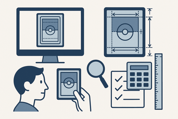
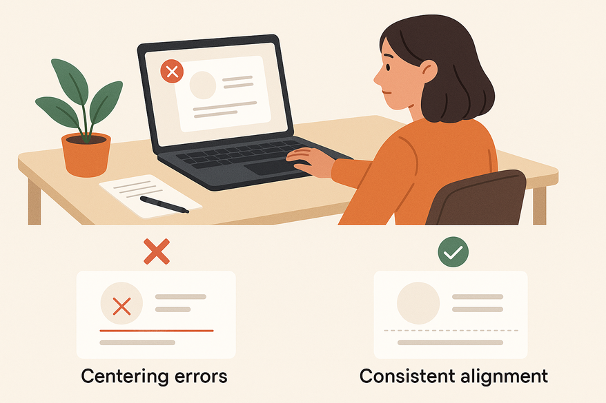
How to Avoid Centering Errors in Card Design: A Complete Guide
Learn how to avoid centering errors in card design to ensure polished, user-friendly cards. Improve visual appeal, usability, and trust with consistent alignment.
Estimated reading time: 12 minutes
Key Takeaways
- Proper centering ensures visual balance and hierarchy.
- Common mistakes include uneven spacing and optical vs geometric misalignments.
- Detection methods like grid guides and the blur test help catch errors early.
- Step-by-step fixes use grouping, spacing scales, and auto-layout.
- Design system integration prevents recurring centering issues.
Table of Contents
- 1. Understanding Card Centering
- 2. Identifying Common Centering Errors
- 3. How to Detect Centering Errors
- 4. Step-by-Step Solutions
- 5. Design Best Practices
- 6. Conclusion
1. Understanding Card Centering
Card centering refers to positioning elements (text, images, icons, buttons) relative to:
- The card container’s horizontal and vertical center
- Other elements inside the card (e.g., icon vs. text)
- The overall layout grid or page flow
True centering creates visual balance and a clear hierarchy, going beyond simple geometry.
Why card centering matters:
- Visual appeal – Balanced cards look professional and tidy.
- Usability & scanability – Consistent alignment speeds up content parsing.
- System consistency – Uniform cards build brand trust and reduce design debt.
In one project, misaligned icons on dashboard cards caused 15% more misclicks. After applying proper optical centering, engagement rose accordingly.
Research insights:
- Visual quality improves with balanced type placement. (Typesetting Tips: Think Twice Before Centering the Type)
- Consistent hierarchy boosts usability. (NN/g – Visual Hierarchy)
- Trust grows with predictable layouts. (Adobe XD Ideas – Visual Hierarchy)
2. Identifying Common Centering Errors
To avoid centering errors, you must first spot them. Below are nine frequent mistakes:
- Misaligned content blocks
Issue: Main block (image + text) drifts left or right.
Cause: Manual nudging; uneven left/right padding. - Unequal internal spacing
Issue: Inconsistent gaps (e.g., 24px vs. 10px).
Cause: No spacing scale; random adjustments. - Ignoring margins and padding
Issue: Top vs. bottom padding mismatch.
Cause: Quick fixes without rebalancing. - Over-centering multi-line text
Issue: Centered body copy harms readability.
Cause: Misusing text alignment for long passages. - Centering elements separately
Issue: Icon, title, subtitle each centered individually.
Cause: No grouping; leads to odd vertical gaps. - Icon/text misalignment
Issue: Icons aligned by bounding box look off.
Cause: Optical center vs. geometric center mismatch. - Varying text lengths breaking centering
Issue: Long titles wrap, shifting visual center.
Cause: No max-width or auto-layout constraints. - Horizontal vs. vertical centering mismatch
Issue: Cards align horizontally but drift vertically in a grid.
Cause: Inconsistent vertical rhythm; variable card heights. - Geometric vs. optical centering in shapes
Issue: Text in a circle looks low despite geometric centering.
Cause: No optical compensation for curved shapes.
Quick check: apply a consistent spacing system to spot uneven gaps early. For a deeper dive, see Centered Card Misconceptions: Understanding Card Layout Errors.
Source: Material Design spacing methodology
3. How to Detect Centering Errors
Use these seven methods to catch misalignment before it ships:
- Grids & guides in design tools
Set up layout grids for your page and internal guides for card padding. Align elements to guides, not eyeballing. (layout grids) - Alignment & distribute tools
Enable smart guides and snapping. Use “Distribute horizontal/vertical spacing” for equal gaps. - Bounding-box vs. optical center check
Switch to outline or wireframe view. Compare bounding boxes to actual visual centers. - Blur or squint test
Blur or zoom out until details soften. Look for weight imbalances or off-center blocks. - Mirror or flip cards
Temporarily flip the card horizontally. Asymmetries become obvious when reversed. - Review checklists
Equal left/right padding?
Consistent top/bottom padding?
Proper text alignment for headings vs. body?
Icons baseline-aligned? - Fresh-eyes peer reviews
Ask a teammate: “Does anything look off?” Laypeople often spot imbalance even if they can’t name it.
Source: Sketch ruler tool
4. Step-by-Step Solutions to Correct Centering Errors
Follow these technical steps to fix misaligned cards:
Step 1: Define card structure
- Identify core elements: image, title, description, CTA, icons.
- Group elements logically into blocks: [Image Block] → [Text Block: Title, Subtitle] → [Action Block: Button, Icon].
Step 2: Establish a spacing scale
- Adopt units: 4, 8, 12, 16, 24px.
- Apply consistently:
• Card padding: 16px on all sides.
• Gaps: 12px between image/title; 8px title/description; 12px description/button.
Source: Material Design spacing methodology
Step 3: Center content as a group
- Group related elements in a frame or auto-layout container.
- Center that frame within the card (horizontal or vertical).
- Alternatively, top-align the group with equal padding for cleaner stacks.
Step 4: Align text appropriately
- Headings/labels: center if short and symmetric.
- Body text: left-align for readability and consistent scan paths. (readable text)
- Button labels: center within the button; align the button in the card per your system.
Step 5: Correct icon/image alignment
- Icons: align to text baseline or optical center.
- Images: crop to a consistent aspect ratio (4:3 or 1:1).
- Align image frames, not raw image content.
Step 6: Use auto-layout or CSS constraints
- In Figma: Auto Layout with defined padding and item spacing. (layout grids)
- On the web:
• Flexbox:
display: flex;
justify-content: center;
align-items: center;
(or justify-content: flex-start; align-items: center for left-aligned text). (CSS Flexible Box Layout)
• Grid:
display: grid;
place-items: center;. (CSS Grid Layout)
Step 7: Adjust for responsiveness
- Test at mobile, tablet, desktop breakpoints.
- Use relative units (%, rem) or design tokens.
- Ensure wrapped text still feels balanced with your spacing scale.
5. Design Best Practices to Avoid Centering Errors
- Define an alignment strategy in your design system (e.g., “All card titles are left-aligned; all CTAs are centered.”).
- Favor system consistency over one-off layouts; use variations sparingly and only when documented.
- Apply typography best practices: line length of 45–75 characters and consistent line-height and margin rules.
- Leverage tool features: build components and styles so fixes propagate globally.
- Test with real content and edge cases: long product names, missing images, zero-character descriptions.
- Ensure accessibility and readability: maintain sufficient whitespace for tap targets and avoid long centered paragraphs that disrupt scan flow.
6. Conclusion
Avoid centering errors to deliver polished, user-friendly cards that feel consistent across your site or app. Centering is part of a larger alignment system—use grids, auto-layout, and clear padding rules instead of eyeballing. Test with real content and across devices to integrate these methods into your next design system update, and watch your card components rise in quality, clarity, and credibility.
If you’re a trading card collector looking to ensure perfect centering before submitting for professional grading, the Card Centering Tool provides automated left-to-right and top-to-bottom centering ratios and flags whether your card meets PSA, BGS, and CGC tolerances—helping you avoid wasted grading fees on off-center cards.
FAQ
- Should I always center content inside cards?
No. Center when it enhances balance; otherwise, left-align text for readability. - Can different card types use different centering?
Yes, if documented in your design system (e.g., “feature” vs. “standard” cards”). - How to handle variable text lengths?
Use auto-layout or Flexbox with consistent spacing and top-align groups when vertical centering fails. - What is optical centering?
Optical centering nudges elements to achieve visual balance rather than geometric centering, especially in circles or icon shapes.