Card Layout and Centering Accuracy: A Complete Guide for Flawless Design
Master card layout and centering accuracy for professional designs. This guide covers card design elements, alignment techniques, and best practices.
Estimated reading time: 8 minutes
Key Takeaways
- Utilize consistent grids, margins, and gutters to maintain geometric balance.
- Apply uniform padding and spacing to ensure internal centering of content.
- Leverage design tool features like smart guides, auto-layout, and align commands.
- Account for variable content lengths and image proportions to avoid visual offsets.
- Test on multiple screen sizes and print proofs for reliable centering accuracy.
- Implement reusable card components in your design system for cohesion.
Table of Contents
- Section 1 – Understanding Card Layout and Centering Accuracy
- Section 2 – The Concept of Card Layout and Centering Accuracy
- Section 3 – How Card Design Elements Affect Card Layout and Centering Accuracy
- Section 4 – Tools and Techniques for Ensuring Card Layout and Centering Accuracy
- Section 5 – Best Practices and Common Pitfalls in Card Layout and Centering Accuracy
- Conclusion: Card Layout and Centering Accuracy Essentials
- FAQ
Section 1 – Understanding Card Layout and Centering Accuracy
What is a card layout and centering accuracy?
A card layout groups related content—image, title, text, and calls to action—into discrete rectangular containers. Centering accuracy means aligning each card and all its parts exactly to the center or to a consistent grid.
Common uses of card layouts:
• Social feeds: post cards and story cards
• E-commerce: product grids and category cards
• Dashboards: widgets and panels
• News and blog previews: article cards
• Print: business cards, trading cards, and modular magazine grids
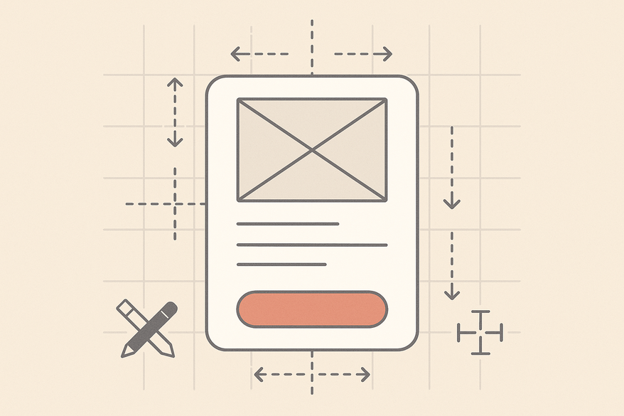
Key design elements inside a card:
• Image or thumbnail: hero photos, avatars, illustrations
• Title or heading: primary label for the content
• Supporting text: descriptions, metadata, dates
• Call-to-action (CTA): buttons or links like “Buy” or “Read more”
• Decorative elements: icons, badges, borders, shadows
A well-structured card layout uses consistent sizes, padding, and alignment so each card feels part of a unified system. This consistency supports precise centering both within each card and across a grid.
Section 2 – The Concept of Card Layout and Centering Accuracy
Centering accuracy means aligning an element or group of elements to the geometric or optical center of its container. In card design, it applies to:
• The card’s position in a grid or page.
• The main content block’s location inside the card.
• Each internal element’s alignment relative to the card edges.
Trading-card centering analogy:
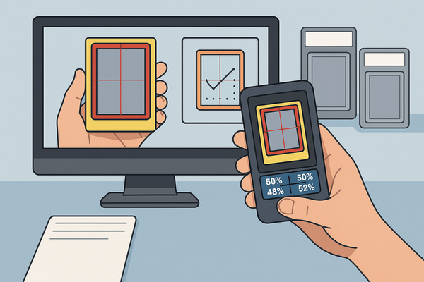
In trading cards, perfect centering is achieved when the printed image has equal borders on all sides. Grading services express offsets as ratios, like 55/45 or 60/40, to show how far the image is from true center. The closer to 50/50, the more balanced the card appears.
Why centering accuracy matters:
• Visual balance: Humans detect slight asymmetries.
• Perceived quality: Even spacing suggests craftsmanship.
• Usability: Consistently placed CTAs are easy to find.
• Brand consistency: Uniform cards strengthen identity.
Section 3 – How Card Design Elements Affect Card Layout and Centering Accuracy
- Margins
• Outer margins are the spaces between cards and nearby elements.
• Unequal left/right or top/bottom margins offset the entire card grid.
• Consistent gutters maintain geometric balance. - Padding
• Inner padding is the distance from content to the card border.
• More top than bottom padding shifts content downward.
• Uniform padding around all sides holds the content block centered. - Alignment
• Center-aligned content brings symmetry but may hurt readability with long text.
• Left-aligned text in a centered card blends clear copyflow with balanced framing.
• Baseline alignment across cards keeps text lines consistent in a row. - Spacing between elements
• Unequal spacing above and below images shifts the perceived center.
• A consistent vertical rhythm (e.g., 8px between stacked items) anchors the content block.
• Even horizontal gaps between icons or badges prevent skewed visual weight. - Varying element sizes, image proportions, text lengths
• Images with different aspect ratios change how heavy a card looks.
• Variable text lengths create uneven card heights, misaligning CTAs.
• Badges on one side only give a 60/40 visual split, undermining balance.
Section 4 – Tools and Techniques for Ensuring Card Layout and Centering Accuracy
Design applications offer powerful features to keep cards and content centered:
- Smart Guides & Snapping
– Automatic edge and center alignment in Figma, Sketch, Adobe XD, and Illustrator. - Align & Distribute Commands
– One-click center alignment horizontally and vertically. - Grids & Layout Columns
– Configure column grids, baseline grids, and pixel grids.
– Enforce consistent margins, gutters, and alignments.
– (algorithms drive responsive centering) - Auto-layout / Constraints
– Figma’s Auto Layout and Sketch’s resize constraints keep padding and alignment intact as content changes.
– (advanced card centering techniques) - Measurement Overlays
– Visualize exact pixel distances between elements.
– Spot unequal gaps and correct them before development or printing.
Step-by-Step Guidelines to Master Centering
- Start with a grid foundation to anchor your cards.
- Define consistent margins, padding, and spacing scales.
- Use smart guides or snapping tools to align elements.
- Apply auto-layout or constraints for dynamic content.
- Verify with measurement overlays or inspection tools.
- Prototype with realistic content sets to spot misalignments.
Light Touch: Pre-Submission Centering Check
Before finalizing your UI or print files, consider using Card Centering Tool to verify border and content centering with sub-millimeter precision. This free web app measures centering ratios and flags whether your layout aligns to your defined tolerances.
Section 5 – Best Practices and Common Pitfalls in Card Layout and Centering Accuracy
Best Practices
• Use a consistent grid and spacing scale across the project.
• Keep padding values systematic; change them only via defined scales.
• Apply optical centering tweaks when strict geometry looks off.
• Design for flexible content with auto-layout or robust constraints.
• Align similar elements across all cards.
• Test on multiple screen sizes and print proofs.
Common Pitfalls & How to Avoid Them
• Misaligned elements across cards – Avoid by using shared templates.
• Inconsistent spacing/padding – Rely on tokenized spacing (avoid centering errors).
• Ignoring variable content – Prototype with realistic content sets.
• Over-centering all text – Combine center-aligned containers with left-aligned text.
• Print production misalignment – Design safe areas, bleed, and small tolerance offsets.
Conclusion: Card Layout and Centering Accuracy Essentials
Accurate card layout and centering shape the user’s first impression and guide their eye through content. Cards offer modular, scannable containers. Their perceived quality depends on how neatly elements align and balance within each card and across a grid.
Key takeaways:
• Build on a solid grid foundation.
• Maintain consistent margins, padding, and spacing scales.
• Use design tool features—smart guides, auto-layout, and align commands.
• Account for real-world content: test with short, long, and missing data.
• Create and enforce reusable card components in your design system.
Final Actionable Step
Develop one or two master card components with defined grid alignment, spacing rules, and content behaviors. Reuse these templates across projects to ensure flawless centering accuracy and elevate the professionalism of your web, mobile, and print designs.
FAQ
- What is the ideal padding ratio inside a card?
- A common rule is to set equal padding on all sides using a defined scale (e.g., 16px) so that content appears centered both visually and geometrically.
- How can I test centering across different devices?
- Use responsive grid systems in your design tool, preview at various breakpoints, and inspect alignment with measurement overlays.
- Should I center-align long text blocks in cards?
- For readability, use a centered container but left-align the text. This preserves balance while improving legibility.
- Are there automated tools for print centering checks?
- Yes, Card Centering Tool and measurement plugins in Adobe Illustrator or InDesign can verify your print layouts.